When it comes to design, the importance of typography can’t be overstated. It can contribute to brand recognition, info hierarchy, and overall legibility.
For those who aren’t familiar with the term “typography”, it’s the strategic arrangement of type in order to make written language readable and visually appealing. In graphic design, typography’s two main purposes are to:
- Communicate a message
- Promote legibility
If one’s typography is failing in either of these objectives, it can greatly affect the desired response from the intended target audience.
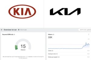
Anyone in the field of design or marketing understands how important brand recognition is, and car companies are among the most recognizable in the world. In early 2021, Kia noticed that companies like Nissan, Volkswagen, BMW, and GM were all rebranding and decided to hop on the bandwagon. Their solution to an outdated and juvenile logo was to design something bold, stylized, and immediately recognizable.
They succeeded in all of those and still, unfortunately, missed the mark.
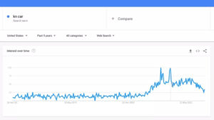
The shortcoming stems from the legibility of the logo, which is lost due to how the company decided to connect the K and the I to the A in the middle of the name. One could argue that the legibility here is a matter of opinion and that the logo clearly reads KIA, but you can’t argue with Google Analytics.
According to Google, over thirty thousand people a day Google the letters KN, thinking that the stylized logo is portraying a backward N instead of an I and A.


While the new KIA logo isn’t the worst logo taboo we’ve seen before, it is a detrimental one and has clearly been confusing drivers since it was unveiled. Here at Mad Men Marketing, we understand how important it is to have a brand logo that not only speaks to you and your business but is legible and above all, effective.


